
Brand Refresh Redbox
When Crackle acquired Redbox, I led the effort to refresh and realign the brand. While Redbox had a strong understanding of its audience, its visual identity had not evolved to reflect the changing entertainment landscape.
The refresh focused on refining the brand's visual language and creating a more cohesive experience across marketing, digital platforms, and physical environments. The goal was to build on Redbox's existing recognition while establishing a consistent, contemporary identity that could move the brand forward.
Rebrand Guidance
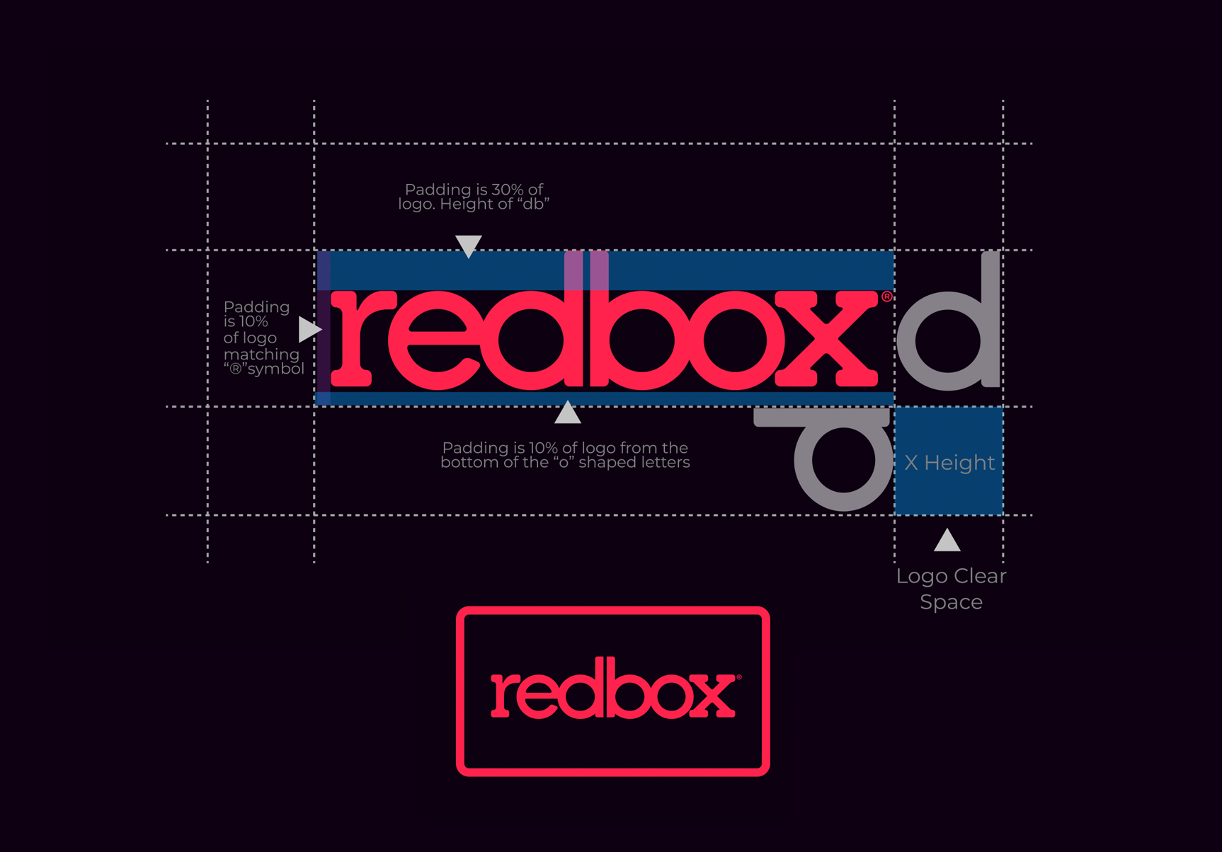
Logo Refinement
The refresh began with refining the existing Redbox logo, removing elements that were no longer relevant while preserving its recognizable identity.
I also developed a secondary brand mark that provided greater flexibility across animation, marketing, and promotional content.
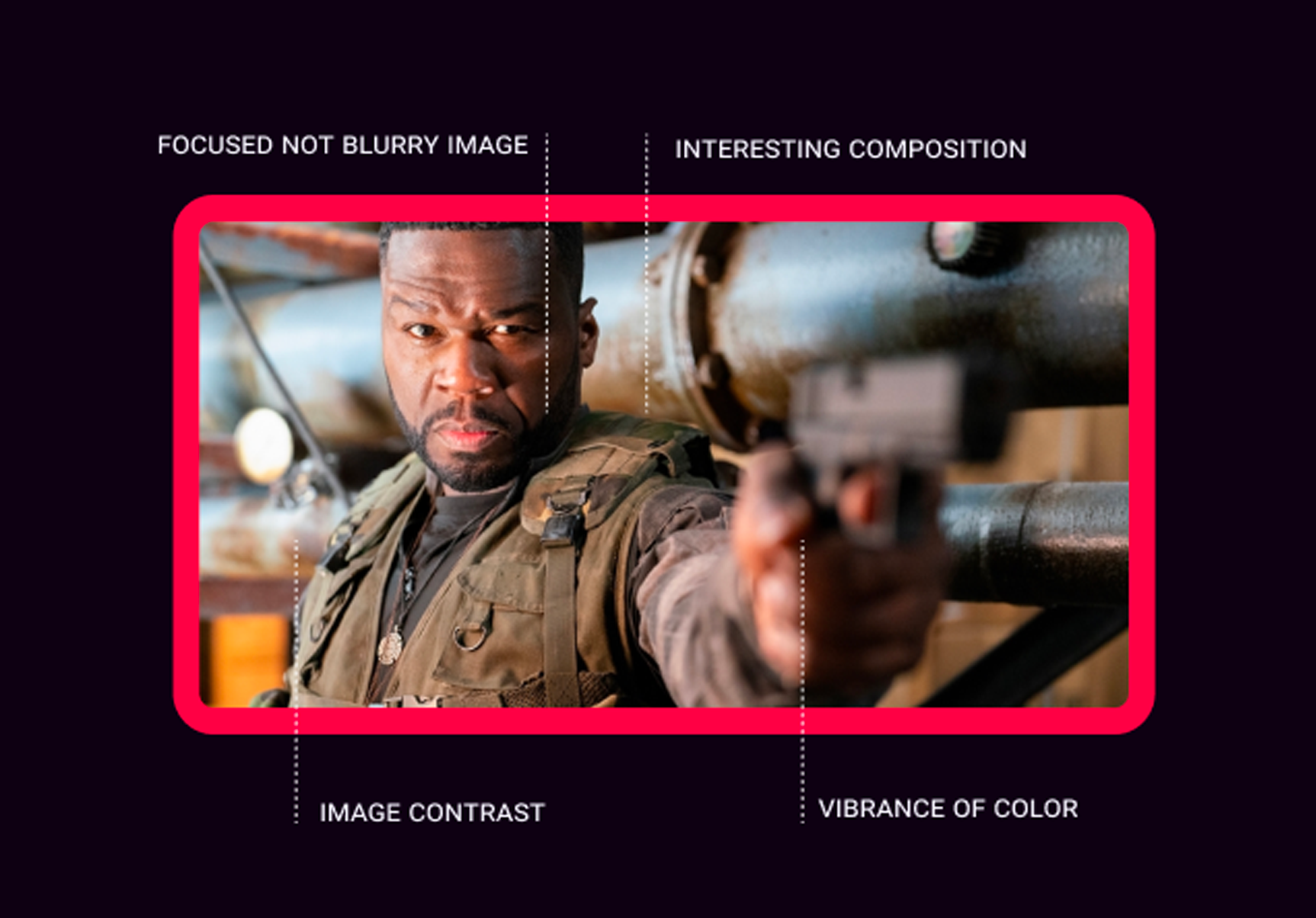
The Frame
The frame became a defining element of the new visual identity. Rather than relying solely on traditional movie artwork, I wanted to highlight the memorable moments that connect audiences to the films they love.
By framing recognizable scenes and characters, the design created a more expressive way to showcase entertainment while reinforcing Redbox's connection to its audience.
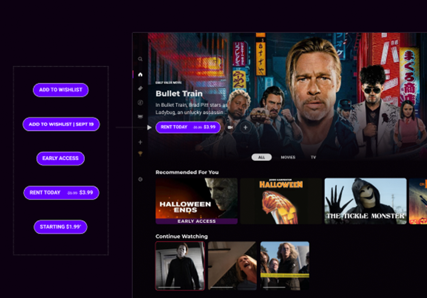
The Style Guide
To maintain consistency across the brand, I developed a comprehensive style guide covering logo usage, color, typography, imagery, and messaging.
The guide provided clear examples, templates, and downloadable assets, giving internal teams and external partners the tools needed to create work that felt distinctly Redbox.
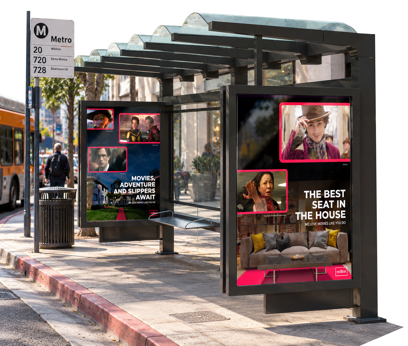
Brand in the Wild
The Redbox brand experience needed to extend beyond screens and into the physical world. I applied the visual identity across billboards, transit shelters, and outdoor advertising, maintaining the same bold typography, color, and visual language established for digital platforms.
The goal was to create a recognizable brand presence that felt consistent wherever audiences encountered Redbox.
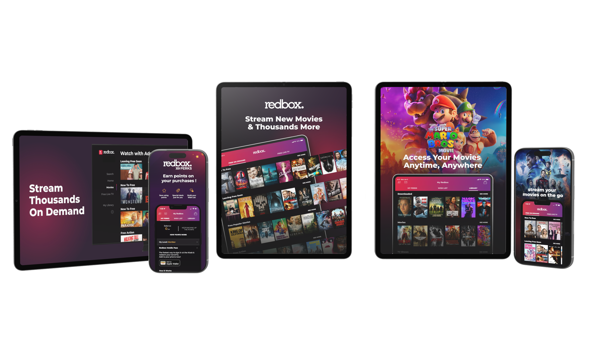
Platform Promotion
With Redbox available across multiple platforms, it was important to maintain a consistent brand experience wherever audiences discovered the service.
I developed a unified approach to promotional messaging and creative, ensuring that everything from app store graphics to connected TV and mobile marketing reflected the same visual identity.
The goal was to create a recognizable presence across platforms while adapting the creative to each environment.
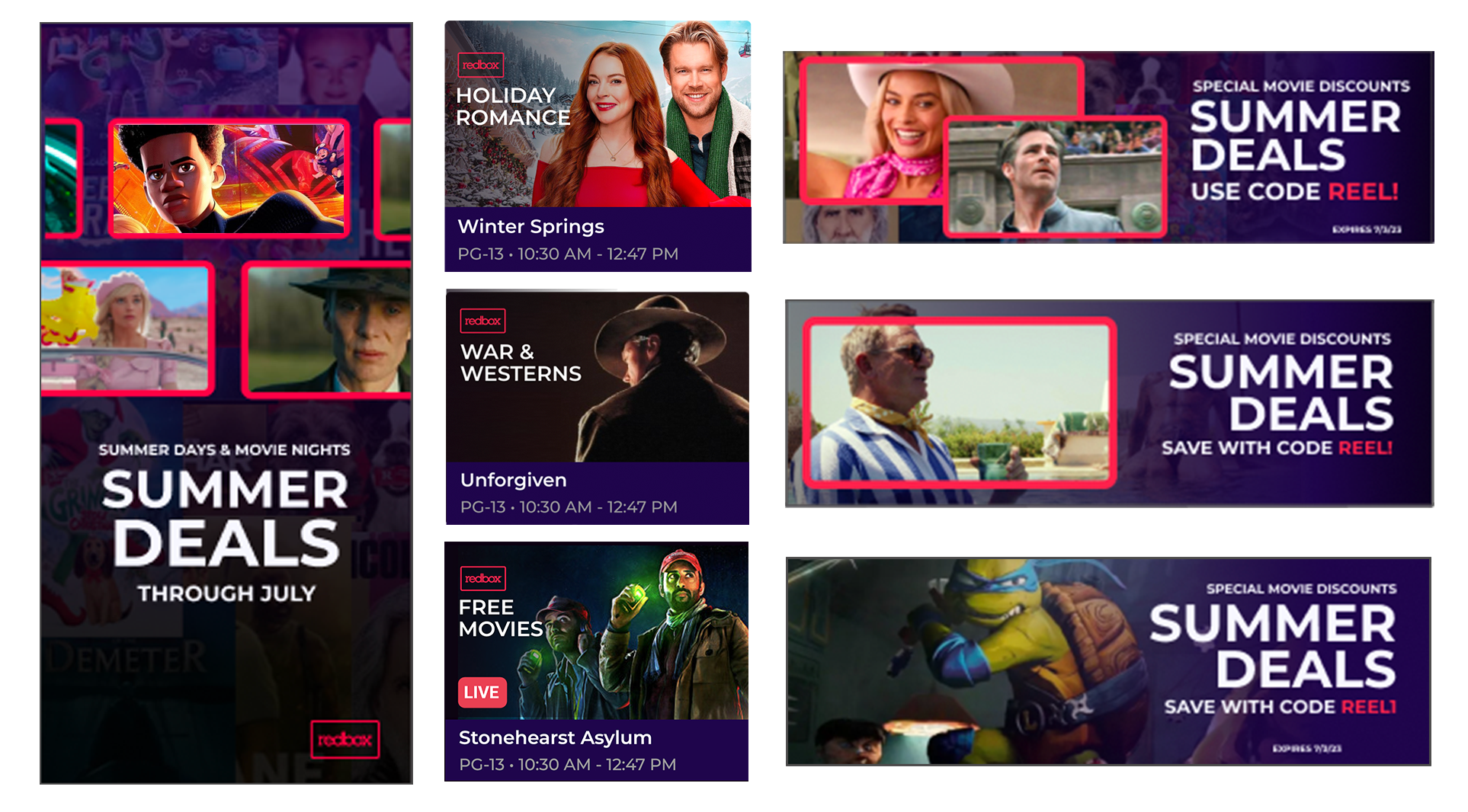
A Consistent Brand Experience
To support the rebrand launch, I developed an extensive library of promotional templates for both in-app marketing and external digital campaigns.
The system established a consistent approach to typography, imagery, color, and messaging while giving teams the flexibility to develop new creative.
As campaigns evolved, the library could expand without losing the visual consistency that connected everything back to the Redbox brand.