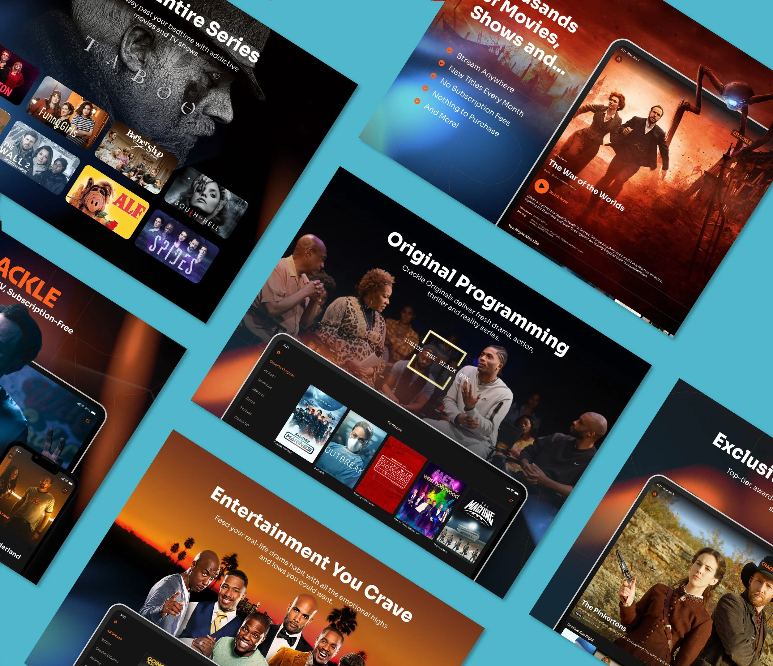
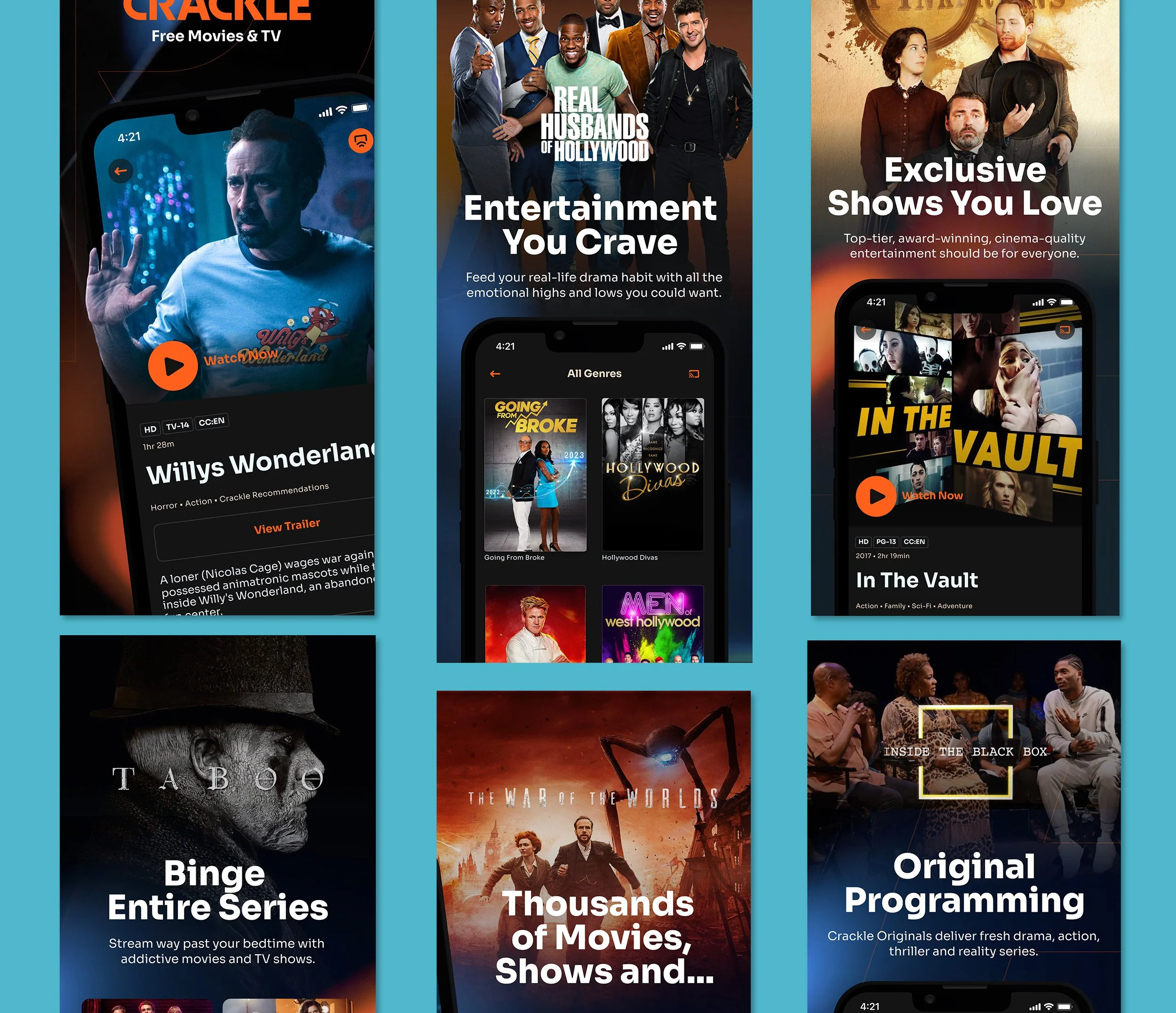
Apple, Google Store App Promotion
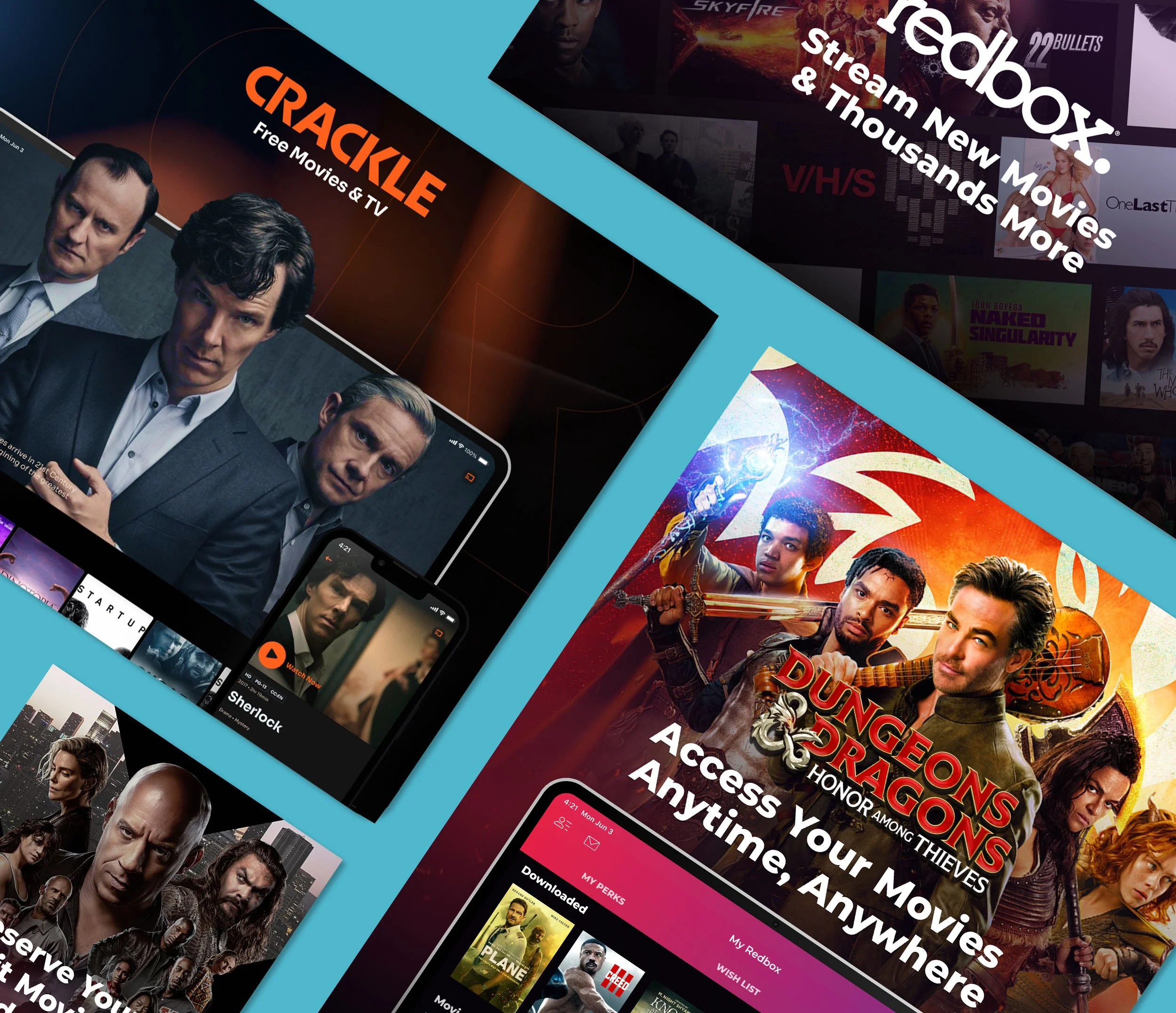
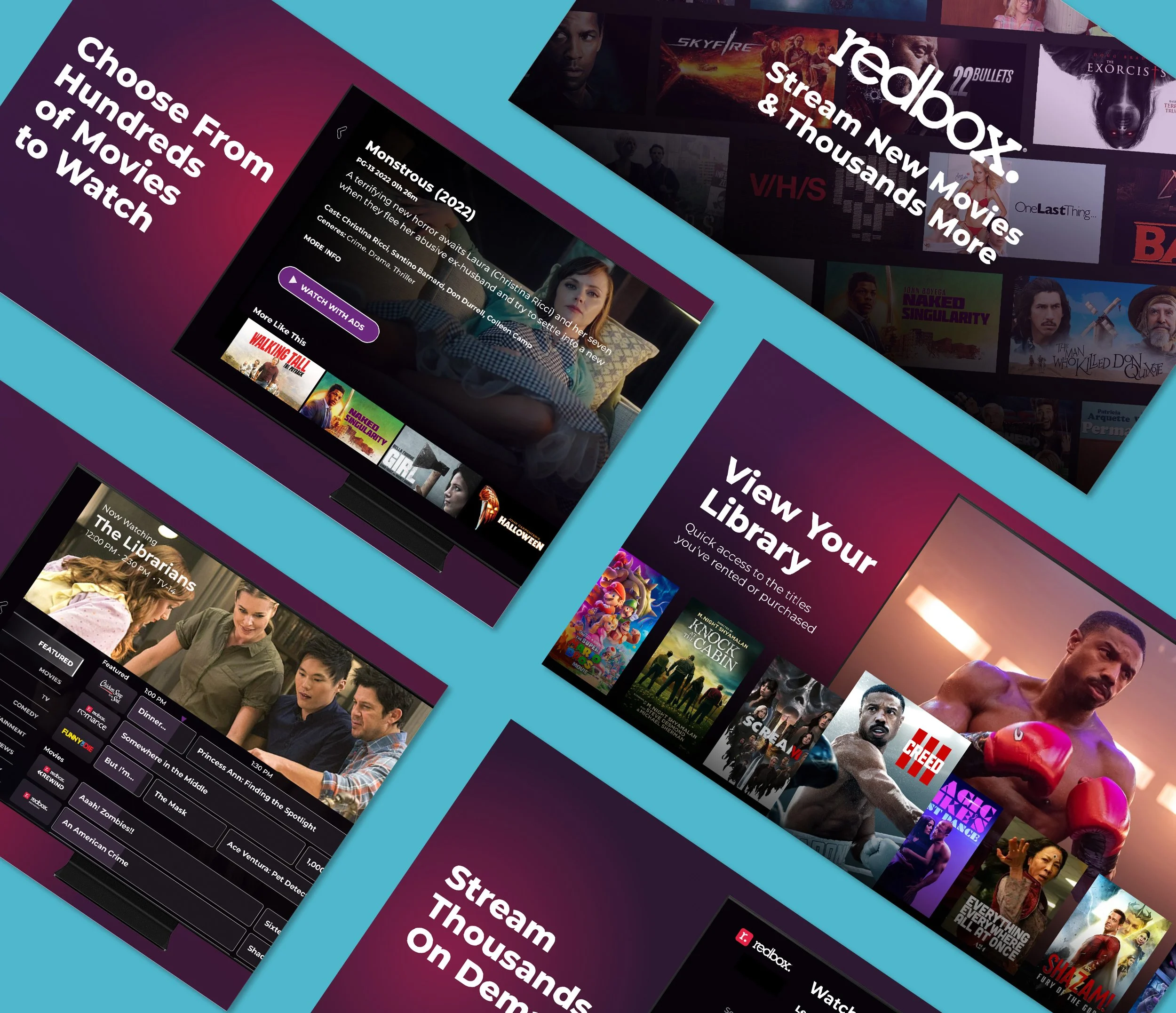
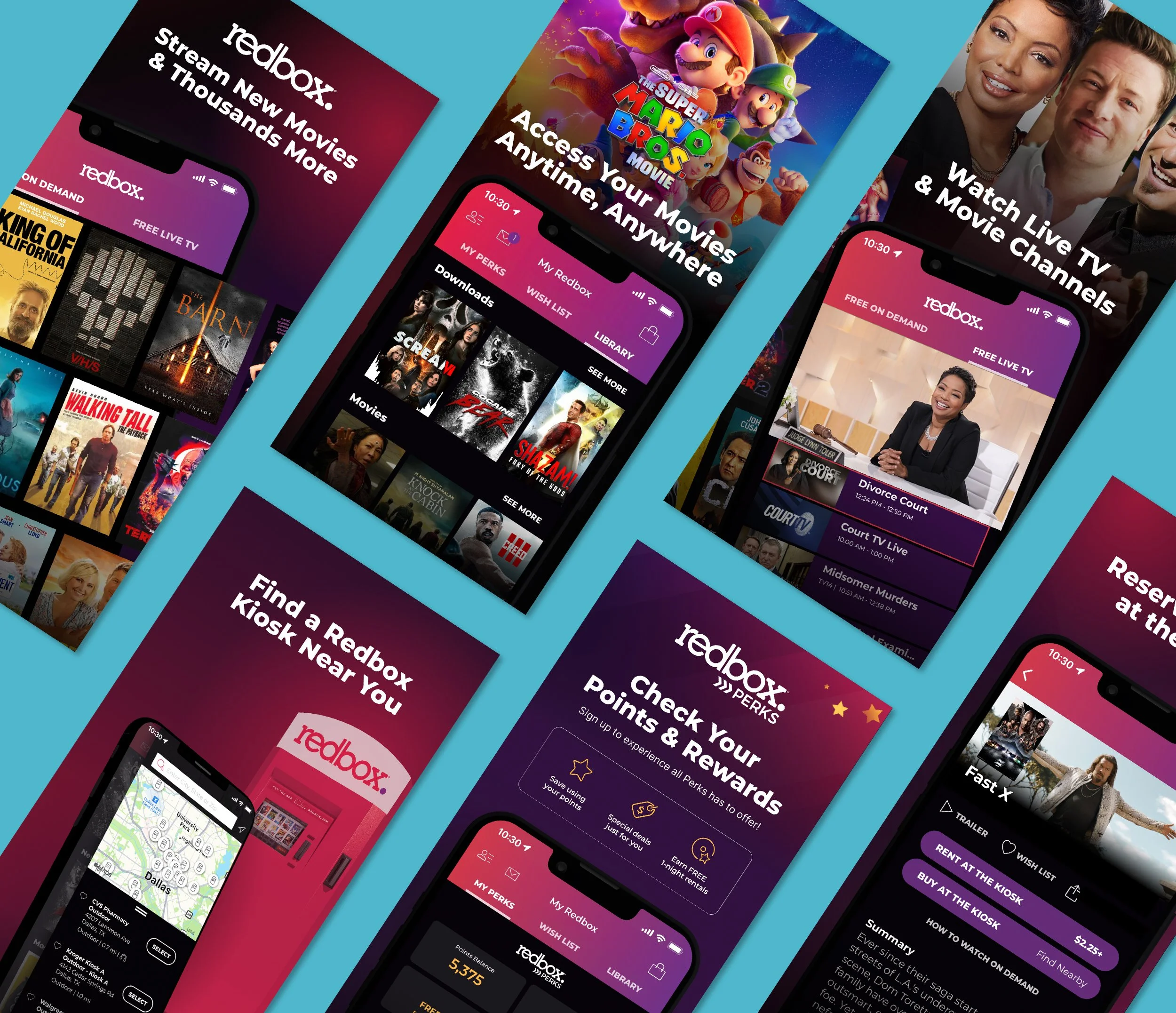
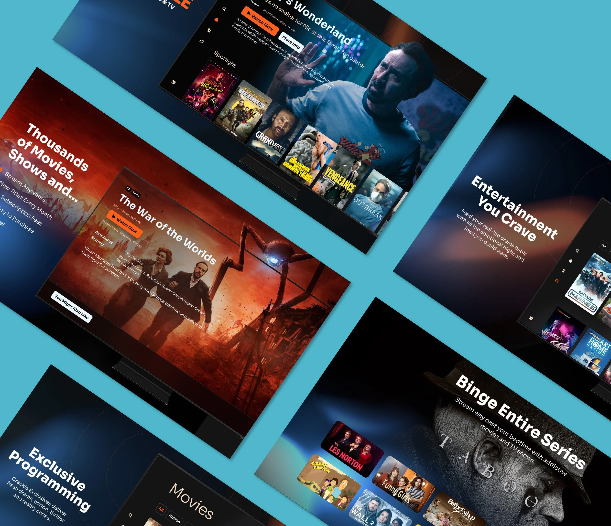
As part of a larger brand refresh, I redesigned the Apple App Store and Google Play Store experiences for the Redbox and Crackle streaming apps. The updated graphics highlighted the brand upgrades for both properties while incorporating curated content aligned with user insights and engagement data. This redesign was not only about visual polish but also about improving discoverability, ensuring the apps stood out in competitive marketplaces. By aligning the creative approach with business goals and user behavior, I was able to drive stronger engagement and reinforce the value of both platforms across digital touchpoints.
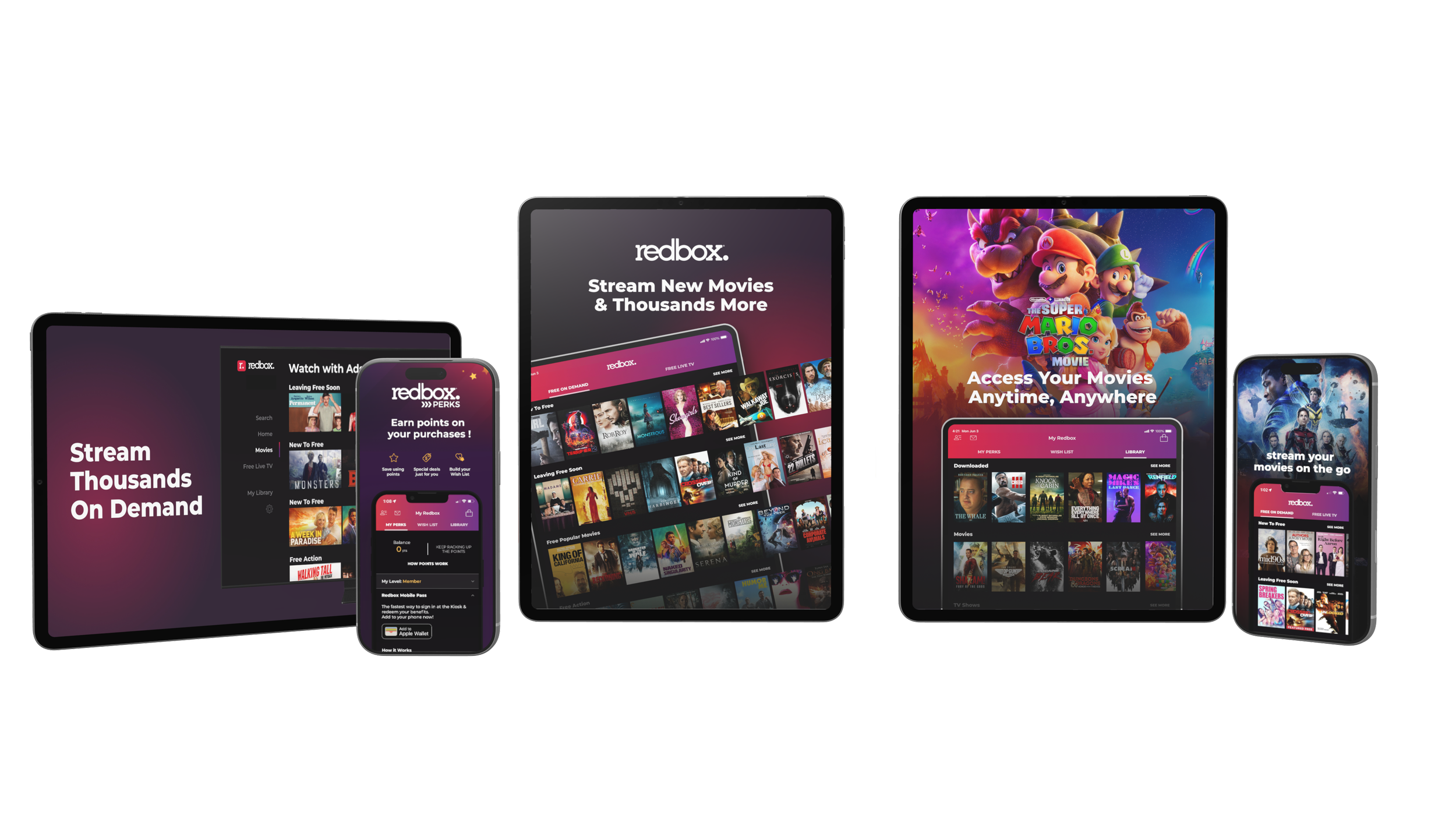
Brand Update
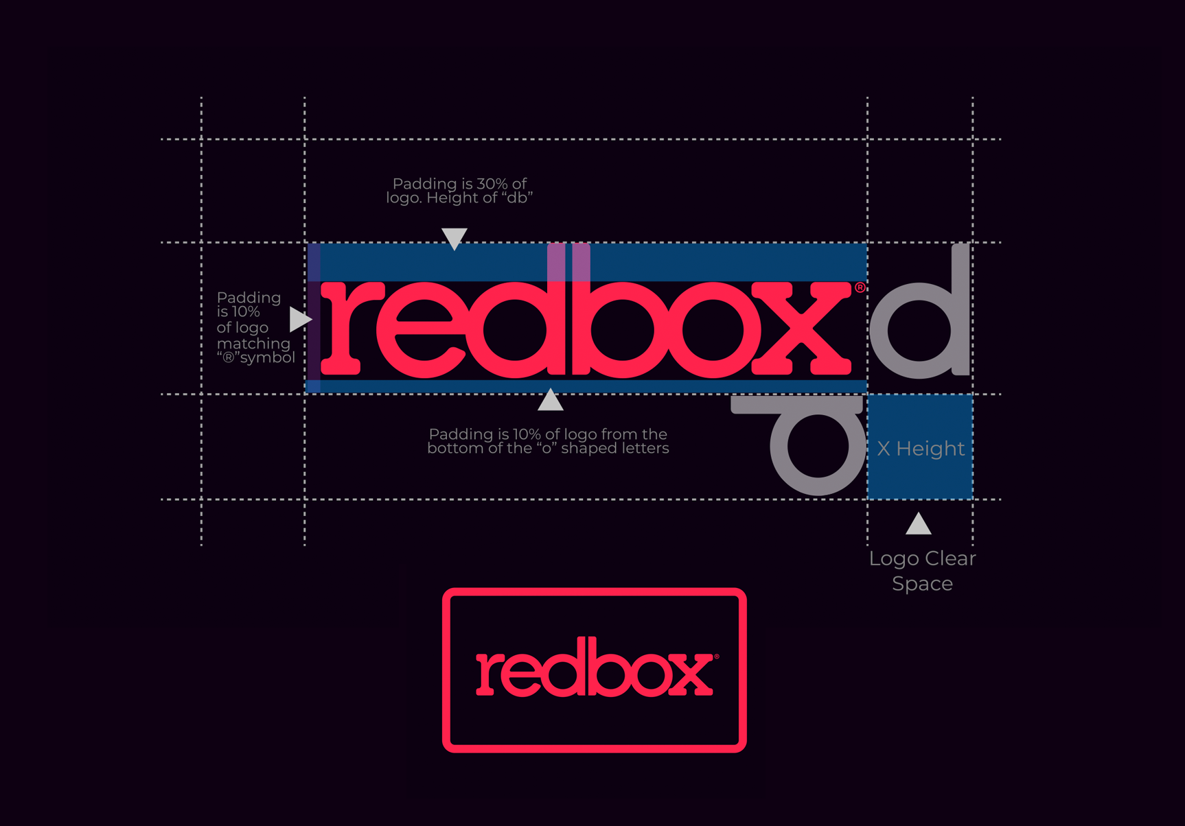
With Redbox joining the Crackle family, there was an opportunity to refine its visual identity while preserving the brand recognition it had built over the years. I focused on simplifying outdated elements, improving consistency, and introducing a secondary brand mark that could be used across motion graphics, marketing campaigns, and digital experiences.
Logo Refinement
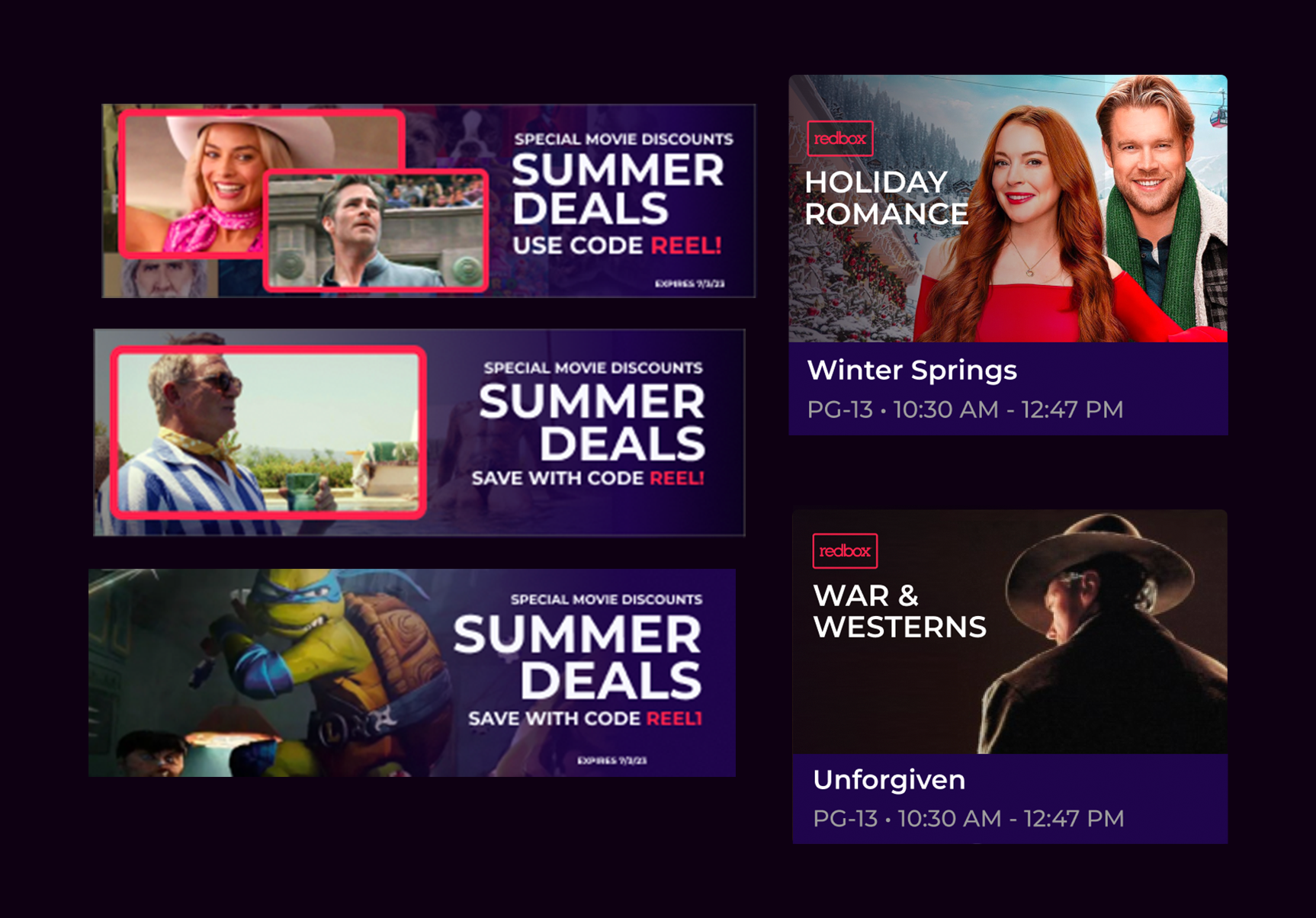
Extending the Identity
To create a more cohesive visual identity, I extended the rectangular frame of the secondary logo into a recurring design element across marketing materials. This framing device helped showcase memorable moments from films while creating a consistent, recognizable look. Bold typography, promotional messaging, and clear calls to action worked together to highlight offers and encourage audience engagement.